


Designing for Words
with book designers Rivkah Lewis and Shanie Cooper
Book design is the first glimpse we readers get into the soul of a story. The design has much to tell us: between the tone, genre cues, to plot hints, we start forming expectations at first sight. But somehow, it seems like book design has fallen behind. While frum consumers have come to expect top-quality design from brands, nonprofits, and magazines, book design hasn’t kept up with the rapid of progress in design trends.
“At the end of the day, there still is this common denominator of a certain type of look, the familiarity thing, and the question is, What does it take to break out of that?”
Today, we tackle this question with two exceptional book designers.
Rivkah Lewis taught graphic design for over 10 years. She designs for corporate and nonprofit clients but specializes in book cover design and typesetting. She works with frum publishers and self-publishing frum authors. Some of my favorites from her designs include Tomorrow, Map the Starlight, and Full Circle.
What do you think is the job of a book cover as part of the reading or buying experience?
I think it's fairly obvious that whoever said, "Don't judge a book by its cover" was not living in reality; we all pick up books based on the cover. The research says that you have about 15 seconds to grab someone's attention on a book cover, then another 7 to 10 seconds to catch their attention on the back. The visuals will project something and that will make you want to pick something up, and you have that small window to make someone hold it in their hands for long enough to decide that they want to read it. We do this through a combination of fonts, images, colors and style. It's the tone of the books. Take for example Ruthie Pearlman’s books, (a series I did not design): they all have a similar look to them, so you know you're picking up a Ruthie Pearlman thriller type of book.
Do you read the book before you start a project?
I don’t read the books before I design them. 90% of the time, I just get the back cover text, and that's enough. Sometimes when it's a very complicated story, I'll ask for more. I once had a book where I didn't feel I had enough to work with from the back cover text and it was a time period I was not familiar enough with. The publisher paid an editor to go through it and write a synopsis of a few pages for me to read, and then I was able to go ahead and research the time period and the main topics.
I have had cases where after I designed a book and got the printed copy and read it, I realized I was missing information; I could have brought out specific elements had I known more. So every once in a while I'll ask for a list of a few key things that are part of the book. And sometimes I’ll design something and then a publishing house will request an additional element that’s important. But in general, the back cover text is usually enough.
Design in the frum world has been drastically upgraded in the last decade, and the frum community has become used to seeing beautiful and modern design in advertisements, branding, nonprofits, etc. Book design, though, lags far behind, with most books featuring designs similar to what was published 15 years ago or from student designers, and few that have been able to replicate the trends in secular publishing. What do you think is holding the industry back?
I would say that the process is different with books than it is with other design items. Firstly, there definitely is some advance in design in the book industry: better fonts, stronger, more compelling imagery, updated inner page design. But I think there is a level of comfort in staying with a certain style because we are not looking to replicate secular literature. The secular style nowadays is cleaner, while we're still putting out busier covers with heavier designs. It used to be that everything Jewish was centered and had a drop shadow behind it, but slowly but surely we broke out of our shell and started making things that look more modern. So on the one hand some things are getting cleaner, on the other hand, we're seeing a lot of the effects that we saw in the nineties coming back in.
We are seeing a lot of ads following trends from the general world, but a lot of publishers are not embracing those right now. Maybe because books by nature are a more traditional thing... At the end of the day, there still is this common denominator of a certain type of look, the familiarity thing, and the question is, what does it take to break out of that?
At the same time, there are publishing houses that are pushing towards cleaner, more current looks. Much of it has to do with who their target market is and if they are appealing to a broader or more insular audience. Each publishing house has its own style.
Also, a lot of the difference in styles is in book interiors. Secular books for younger readers have a lot more going on on the actual pages as opposed to just the plain text we've always had in the past. We always had a chapter header graphic, but the rest of the pages were clean. There are definitely publishing houses now that are using secular books for inspiration and switching to this more fun, engaging style for young readers.
I'm thinking of one cover you designed, Shuli Mensh’s book Tomorrow. The typography was a beautiful serif font that you use there, and the image, it’s so tonal.
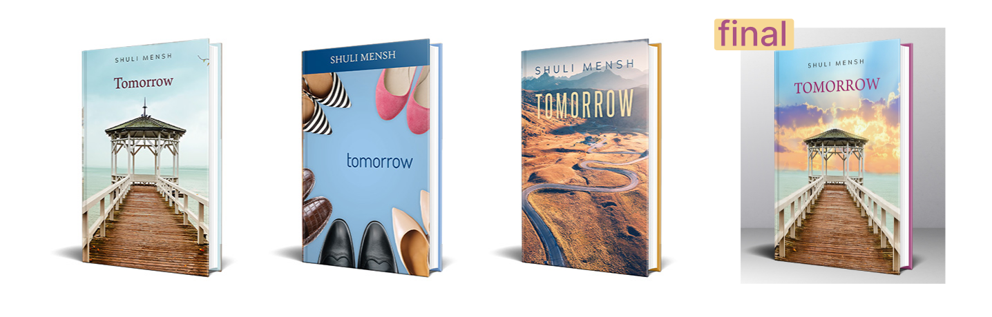
That was a more secular style. It's funny that you mentioned that book because actually in Judaica Press’s brief for Tomorrow, they said, “We want more of a secular look.” They were going for something cleaner.
A book is the type of thing where the author and editors spent years working on this thing. So because the frum publishers aren't as corporate as you would get out there, it becomes even more subjective and everybody's very enmeshed.
I've had authors who wanted things that were just totally not viable for a book cover. It's a matter of holding their hand and guiding them. This is their baby, something that they've worked on and that they love and they’re invested in. And they aren’t always able to say, I thought I wanted a __ on the cover, but really that's not going to effectively sell my novel. My goal is to take what they want and translate it into something visually appealing so it will sell while trying to respect the author’s wishes as well. It's a balance.
When I design a book cover, I always design three options. When I work with private clients, the author will see all three and decide, or maybe they'll ask their six best friends. But with a publishing house, it could be that the author is sent only one of the options and told, “This is the cover of your book. You can make minor changes in color and font.” It’s a process with a lot of people in the middle.
When working on something like Map of Starlight, there was a designer at some point at Mishpacha magazine who thought about the story and designed a beautiful page layout for it. Do you ever go back and look at what they did?
Sometimes the publisher will send me what the magazine did and I'll find out from the author whether she wants something like that or something totally different.
When I designed Rocking Horse, I saw what Menachem Weinreb designed for Mishpacha. It has a rocking horse on it, and I didn't want to copy his design. But the book is called Rocking Horse, so it makes sense to have a rocking horse on the cover. All my drafts had rocking horses. There was one that was more vector style, one had a different style horse… But yeah, sometimes it will come out similar just because you don't always have to reinvent the wheel.
It's funny, with Map the Starlight, Leah Gebber didn’t connect to the cover in the beginning. She thought it looked like a pirate ship, so we went back and forth on different design options. Then in the acknowledgments, she wrote, “Rivkah Lewis, thank you for that magnificent cover.” And in parentheses, she wrote, “I love the ship.” Sometimes things need to grow on people.

What are you in the middle of working on? What's coming up?
Oh, lots of things. I'm working on a book written for orphans, by Rabbi YY Rubinstein who is an orphan himself. It looks amazing. I just got an email today telling me which cover he chose. I got an interesting email this morning from Rebbetzin Feldbrand, who I've done many books for privately. She’s putting out a very interesting book in a number of months. I’m also in the middle of a book about the Surfside collapse and typesetting three other books. Among other projects…
Is there a book cover that you appreciate or admire that you did not design?
Solomon’s Baby, designed by Bina Sklare. I first saw it when I checked the cover proof before it went to print, and I felt that it would stand out - it's not typical design.

What are you reading? Anything now that you could, you could recommend read, read something recently that you, you could recommend?
Right now I'm reading Bumps in the Rhode, the third book of The Rocky Rhodes series. I did the interior of the book. I know about half the story just from skimming it while putting corrections into the book while type-setting. It's a nice, fun read.
Shanie Cooper is a graphic designer who specializes in children’s book design, both book covers and interior layouts. She works with frum publishers and self-publishing secular authors. Some of my favorites from her designs include There’s a Frog on My Stage, Bubby Karp, and the Eliza series.
You started out doing a wide variety of graphic design, and later focused on books. What is it about book design that speaks to you?
I just like books. I think that anything I could do to help bring books into the world is great. And it's not just having more books, but having more nice books in the world, books that are easy to read and exciting to pick up.
How would you make the case to someone who is less visual about why the design of a book is important?
My goal is that you should have no idea what I did. People ask me about a picture book I worked on, “Oh, you drew the pictures?” And I'm like, “No.” They're like, “Oh, you wrote the book?” No. So what did you do? They can't find it. A well-designed book is when the text and the pictures work seamlessly together to provide a comfortable and exciting reading experience. You won’t notice when it's done well, but when it's done poorly, it's terrible.
My specialty is children's books. I do some novels, some early readers, and all ages of children's books. When an easy reader is not designed properly, kids can't read it. They'll stumble over the words or they won't know where to go, and they'll just give up. A lot of research goes into the exact fonts that we use to make it easy for kids to read, like the shape of the A. A kid who's learning how to read won’t necessarily recognize the type of A with the loop on the bottom, which is something you need to take into consideration.
Design in the frum world has been drastically upgraded in the last decade, and the frum community has become used to seeing beautiful and modern design in advertisements, branding, nonprofits, etc. Book design, though, lags far behind, with most books featuring designs similar to what was published 15 years ago or from student designers, and few that have been able to replicate the trends in secular publishing. What do you think is holding the industry back?
I think that a big part of the issue in the book design world is that book designers and illustrators don't look to the greater world for inspiration. They stay within the pool of frum authors for inspiration.
The reason the frum publishing world started up in the first place is to counteract the secular world. Frum newspapers started because there were secular newspapers, and frum people wanted something to read. So the frum publishing world started up as a response to the secular publishing world. So I think people in the frum publishing world are a bit wary of going to the secular publishing world for inspiration because that's the very thing they're meant to counteract.
At the same time, it is absolutely possible to make kosher designs and get inspiration from the wider world. There are so many trends going on in the secular world that I would just love to see. If I want an illustration on the cover, it's very hard to find illustrators who are willing to do what I like to do.
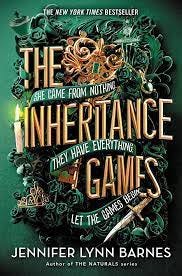
There's a big trend now in YA (young adult) book covers, which I would love to see on a frum book, but I don't have anyone who I could do it with. It’s a style where the title fills the whole cover and the illustrations kind of wind around it and are part of the title. I've seen that everywhere. I've seen it in flat, in floral, I've seen it for nonfiction, fiction, fantasy. The Inheritance Games by Jennifer Lynn Barnes is one example.
It's such a beautiful style, but I can't do it because the publishers reject it and the authors get horrified and they're like, you can't do it, it has to look more juvenile. And I'm like, No, it doesn't. YA is for 16, 17-year-olds, they think they're adults, so let's treat them like adults.
Are there any other styles that you could think of that are like specific trends within the secular world that you'd love to see come to the frum world?
I really would just love to see more style in picture books. Anytime I have a chance to speak to illustrators, I tell them to look outside of the frum world for styles. If you want to take a frum class, fine, but I think they should also take classes from secular illustrators. I’m not talking about classical art. I'm talking about online Zoom classes teaching children's illustration, there won’t be anything bad in that. One of the publishers I work with is a subsidiary of Urim Publishers called Flashlight Press. One of the things the editor tries to do is to get different styles. It's amazing, I’ve worked on probably close to 50 books with them over the years, and every single one looks different. You have to think out of the box.
Are the illustrators that you work with usually frum people?
I work with both frum and secular illustrators, it depends on the project. We obviously prefer working with frum illustrators but they’re expensive, and their styles tend to be similar because again, they all work off each other. There are maybe 2 or 3 people giving illustration classes now, so the whole new crop of illustrators looks like one of them. But one of the big issues with using a secular illustrator is that you have to be so careful when you do it. Their characters don't look Jewish. You'll tell them to put a kippa on but they don't understand what that means. You have to go through it with a fine tooth comb. Are the mezuzas on the right side of the doorway? Is the hair too long, fluffy, or spiky? Do they have the right amount of strings in the tzitzis? You have to go through every detail, it's a lot more work.
How does your process differ if you're working with a frum publisher versus a private author?
When I work with a publisher, I don't usually work with the author, I'm working through an intermediary. Publishers have a whole set of considerations than an author does not. A publisher is more concerned with the market. So when I'm having a conversation with a publisher, it's all about, How can we sell this book? What does our audience expect? With authors, it's a passion project. Most of them couldn't care less about the market, they just want a book that looks like what they have in their head.
Do you typically read the book before you start a project?
I always read the children’s’ books, but when I do adult books, most of the time I don't read the whole book. And a lot of times I don't even get a copy. It depends if I'm working with a private person or if I'm working with a publisher. Publishers will usually share the summary that goes in the back or the front flap, and sometimes the first two or three chapters and you find that it's usually enough. Occasionally, it's not enough, sometimes I’ll speak to the author too.
Can you think of any specific project that you've done that you would say was your most challenging book?
Personally, the thing I find to be challenging is the person, not the book. I have a hard time working with certain people because we don't shtim. Design is very subjective. I've had people who have stopped working with me and said, You're just not seeing our vision. And they went to someone else, and the cover they came out with is something I never would have done, so it's good they went to someone else.
I have a very specific style. My style tends to be a little bit more orderly, my designs are not chaotic. So sometimes someone has something in their head, they want an explosion or something like that, and it's very difficult for me to do that because that's not the way my brain works. I tend to organize things. So sometimes it's a clash. You learn to have a thick skin in this business.
What frum books have you read recently that you can recommend?
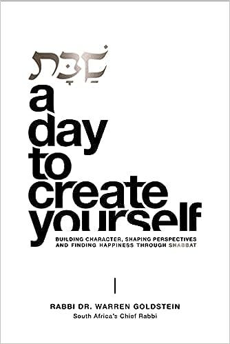
I’m excited about a new book I got recently, Shabbos: A Day to Create Yourself by Rabbi Warren Goldstein. It's a terrific book and a gorgeous design, by Sharon Horev.
The first thing I did was look in this copyright space to see who designed it. Another book I got recently is Let’s Get Benching by Tamar Ansh - this is phenomenal. And Who Wears A Yarmulka? By C.B. Lieber - so, so adorable.
What's coming up next for you? Are you working on any exciting projects of things that are going to be released soon? Anything like that?
I'm working on a lot of things that are gonna be released soon that I can’t talk about. I'm also an author, I put out one picture book, about my grandmother called How Oma Says I Love You. The one that I'm working on now is a middle-grade novel with time travel, 13 year old boys go back in time.
Oh, I hope I get to see that because we need to bring more speculative fiction, science fiction, fantasy, all that kind of stuff, to frum kids.
What are your favorite frum book covers? Hit reply and let me know, let’s recognize and shout out beautiful design!